Logo design for Studio Flos.
Studio Flos is run by Claire Cassidy, a Sydney based ‘hand-cut paper illustrator and all-round maker of things’.
Claire’s work is full of personality, with vibrant colours, bold shapes and hand-cut typography, so we wanted the logo to reflect that playful and handcrafted energy. The eyelashes and typography can both be used as a stand-alone logo, and are intentionally designed to reflect hand-cut imperfections.
Wedding branding and stationery
This was such a fun brief - bright contrasting colours, messy and spontaneous hand-lettered typography and a modern aesthetic. Choosing the colour palettes for the digital invites and website was a lot of fun, and then I pulled the main colours through to the printed stationery. Mixed with the modern uppercase font it felt like the perfect brand for a fun and relaxed couple with heaps of personality.
Classic and minimal Spring wedding invitations for Hus & Clare.
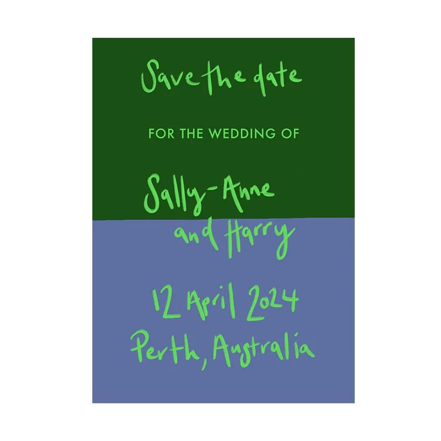
Save the date, and invitation design.
Fun and colourful summer wedding invitation and stationery design for Kate and Ian. I combined hand painted typography with a clean and modern font, and used watercolour and pencil to create the pattern. More info here.
Invitation, extra information slip, order of service, table plan, and thank you card.
Harold and June branding.
Branding for a boutique vintage clothes store.
Pink Elephant Spices Packaging (student brief)
For this packaging brief I chose to design a range of Indian spice mixes originally created in the Pink Elephant Cookery School in Jaipur. These spice mixes can now be bought in high end stores in the UK, and provide hassle-free, authentic tasting Indian recipes, perfect for busy professionals and families.
I did some ink drawings initially and developed some patterns from there. I wanted to create a vibrant brand with a clear focus on Indian design. I combined the patterned elephants with clean and simple typography to ensure the design remained modern.
Footscray Community Profile Report
This brief was for a report following a census done every 5 years in Australia, focusing on the area of Footscray near Melbourne. The demographic is broad, diverse and generally time poor. I wanted to ensure the facts could be read quickly. I created eye-catching info-graphics and tables, using a simple but bright colour palette. The population of the area is a fairly young one, so I wanted an edgy feel and used interesting green images with overlapping typography for something a bit different.
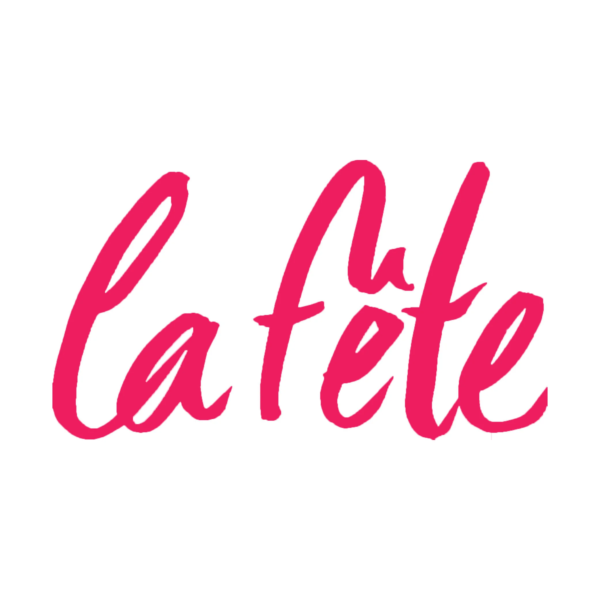
La Fête Fashion Symposium (student brief)
For this brief I was asked to come up with an identity, name and brand mark for the Women's Wear Daily 2013 International Fashion Event, as well as to design a poster, a website and tickets for the event. I chose the name La Fête to give the four day event a fun and festival feel, which I emphasised with the use of hot pink watercolour typography. I combined this with my own black and white photographs of 'backstage fashion' shots giving a sense of the stylish and fun details of the fashion industry.
Small business logo design.
Logo design and business cards.
Silk iPad Magazine (student brief)
This brief involved choosing a title for a quarterly digital arts magazine, which features information on the latest trends in culture, art, music, photography, architecture, design, fashion and more. I also had to design a front cover and a vertical scrolling article. I chose the name Silk to reflect the high end and top quality content of the magazine, and used stylised fonts and a soft colour palette throughout. The magazine design includes interactive features such as scrolling galleries and slideshows.
Cisco Corporate Social Responsibility Report (student brief)
For this brief I was asked to produce a report highlighting the company's positive impact on society, to be sent out to shareholders and interested members of the public. I was asked to stick to the brand guidelines, only use three of the brand's colours and no images. I wanted to create a graphic to hold and emphasise the company's statistics, and used this through the design to create an interesting and eye-catching report.
Drinks Branding - Glug Milk (student brief)
For this drinks branding brief I chose to create an organic, healthy but most of all super tasty milk. This milk would be sourced from the best of British cows and packaged in small 330ml cartons as an 'on the go' drink. I wanted Glug to appeal to creatives and young families, who take an interest in their health, are willing to spend a bit more for better quality, and like to support small British businesses.